Linear and Polynomial Regression
Regression analysis is a technique to create statistical models describing the relationshp between dependent variables and explanatory variables (or independent variables). Depending on the type of this relationship (shape of the best fitted curve), the number of dependent and independent variables, and whether they are of continuous or binary nature, one applies different type of regression. If chosen properly, it helps to predict future behaviour basing on a data from the past (e.g. to assess risk in financial services, goods prices or consumer behaviour) as well as explore correlation between the objects. Here we disccuss only linear and polynomial dependencies; the interested reader is referred to this article for a brief description of a few other methods.
Linear Regression
This is the oldest type of regression. In the simplest case there is only one independent and one dependent variable, that is, data related to certain phenomenon consists of points \(\ (x_1,y_1),\, (x_2,y_2),\, \ldots,\, (x_n,y_n)\ \) which indicate linear dependence. To find this dependence one looks for a straight line which best fits the data. This can be done by minimalising the distance between the points and the desired line: the ordinary least squares method. Namely, one has to determine the matrix \(\ B\ \) such that
Note that if not the presence of the matrix \(\ X^T\ \) on both sides of the equality, this matrix equation would have the form \(\ y=XB\ \), that is, it would describe solutions of the system of equations
suggesting that each data point lies on the same line. However, in general such situation does not take place, and thus such a simple system would not have any solution.
On the other hand, if only the (square) matrix \(\ X^T\cdot X\ \) is invertible, the equation \(\ X^Ty=X^T\cdot XB\ \) has a solution for \(\ B=(X^T\cdot X)^{-1} X^Ty\ \). This gives the line that best fits the data:
Example 1. 1
Assume that you go for a long trip and want to predict how much money you should allocate for petrol and when you should stop to fill up the tank. You have observed the efficiency of your car and collected the data.
Of course, this data carries an error of measurement and depends on fluctuation of petrol prices, but overall there should be a linear dependence between how much money you pay and how far you can drive with the petrol you bought. This seems to be confirmed by the graph of the data points:
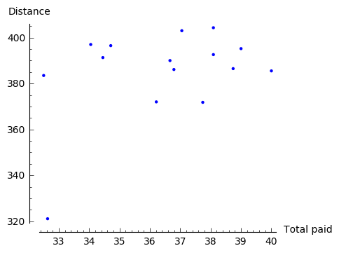
Hence, it makes sense to apply linear regression.
However, before we can make any computations on the collected data, we need to open it first by Sage. In order to do this we have to import necessary packages: urllib (for opening URLs) and csv (for reading .csv files). We call the accessed file by data.
Note
If the file Car_efficiency.csv is already saved in the computer, it suffices to upload it to Sage and write two lines:
sage: import csv
sage: data = csv.reader(open('Car_efficiency.csv'))
Now that we can access the data with Sage, we interpret it in a form of a table:
We are ready to define the vector \(y\) and the matrix \(X\), and thus to find a line which best fits the data.
Now it is very easy to find out how much on average one has to pay to drive \(y\) km:
Experiment with Sage!
How far would you like to drive? Check the outcome (an average cost) for various values of \(y\) (distance). What may be the reason for an unsatisfactory answer in case of low values of \(y\)?
In the above example we skipped an important moment when one has to decide which variable depends on the other. As we will see below, this is not always a natural choice to make and wrong decision may lead to unreal results.
For instance, if in the above example we chose distance as an independent variable and applied the ordinary least squares method, we would obtain the following solution:
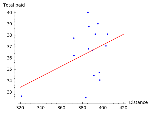
This does not lead yet to ridiculous consequences, but clearly it matches the data much less and suggests lack of linear relation.
Example 2. (correlation)
Linear regression may be also used to investigate correlation between two phenomena: we say that two types of behaviour are correlated \(\,\) if they manifest linear dependence.
We will investigate correlation between rate of unemployment in various countries and amount of benefits given by these countries. 2 The data, which can be viewed `here`_, was downloaded and extracted from OECD databases 2. This time, however, the symbol separating the consecutive entries is not a comma (as the name Comma-Separeted Values suggests), but a semicolon. This fact has to be mentioned to a function reader in order to open a file:
sage: import urllib, csv
sage: afile = urllib.urlopen('http://visual.icse.us.edu.pl/LA/_static/Benefits_and_unemployment_2015.csv'))
sage: data = csv.reader(afile, delimiter=';')
Of course, this is not enough to make any operations on the data; as before we have to interpret it as a table. The table will consist of four columns: ‘LOCATION’, ‘Country’, ‘Value-benefits’, ‘Value-unemployment’.
First we take an assumption that the unemployment rate depends on the amount of benefits, i.e. the vector \(x\) contains the values from the column ‘Value-benefits’, and the vector \(y\) contains the values from the column ‘Value-unemployment’.
Experiment with Sage!
Press Evaluate to see ilustration of the data discussed in this example.
Then fill in the gap in the code below with the steps of the ordinary least squares method
in order to find a straight line that best fits the set of points \((x_i,y_i)\) from the data.
(Do not forget to draw the resulting line \(l\)!
You may do this for example by replacing pic in the last line of the code with pic+l.)
For the interested reader we provide explanation of the abbreviations used in the figure:
AUS |
AUT |
BEL |
CAN |
CZE |
DNK |
FIN |
FRA |
DEU |
GRC |
HUN |
ISL |
Australia |
Austria |
Belgium |
Canada |
Czech Republic |
Denmark |
Finland |
France |
Germany |
Greece |
Hungary |
Iceland |
IRL |
ITA |
JPN |
KOR |
LUX |
NLD |
NZL |
NOR |
POL |
PRT |
SVK |
Ireland |
Italy |
Japan |
Korea |
Luxembourg |
Netherlands |
New Zealand |
Norway |
Poland |
Portugal |
Slovak Republic |
ESP |
SWE |
CHE |
TUR |
GBR |
USA |
CHL |
EST |
ISR |
SVN |
LVA |
Spain |
Sweden |
Switzerland |
Turkey |
United Kingdom |
United States |
Chile |
Estonia |
Israel |
Slovenia |
Latvia |
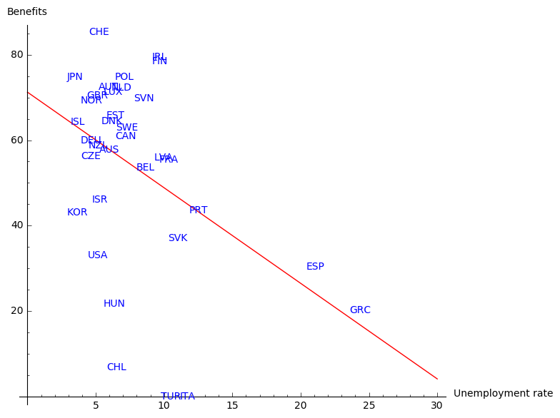
The graph suggests that there is indeed a correlation between the amount of benefits and long term unemployment: the higher the benefits, the lower long term unemployment. The countries that hardly fit in this picture are Greece and Spain. This is not so surprising if we recall that these two countries (especially Greece) suffered from serious crisis in 2015. There are, of course, a few other factors that should be taken into account to draw the right conclusion in such a complex topic. We leave at this place as we start to drift away from the subject of this book. The interested reader may compare the figure above with the graph on Wikipedia page presenting the relationship between poverty reduction and differing levels of welfare expense by different countries.
We finish this example with a graph presenting linear regression under assumption that the amount of benefits depends on the rate of unemployment. Perhaps: the lower unemployment, the more money for benefits?
This result seems to represent the actual situation in a worse manner. Nevertheless, it conveys the true fact: if rate of unemployment in a given country crosses a critical point, the country will not have enough money for the benefits.
Polynomial Regression
The idea behind this method lies in finding a polynomial that best fits the data. The best fit may be achieved in the same way as for the linear regression: by applying the ordinary least squares method. We demonstrate it by looking for a polynomial of degree two, but the same technique may be easily generalised to polynomials of higher degree.
Example 3. 3
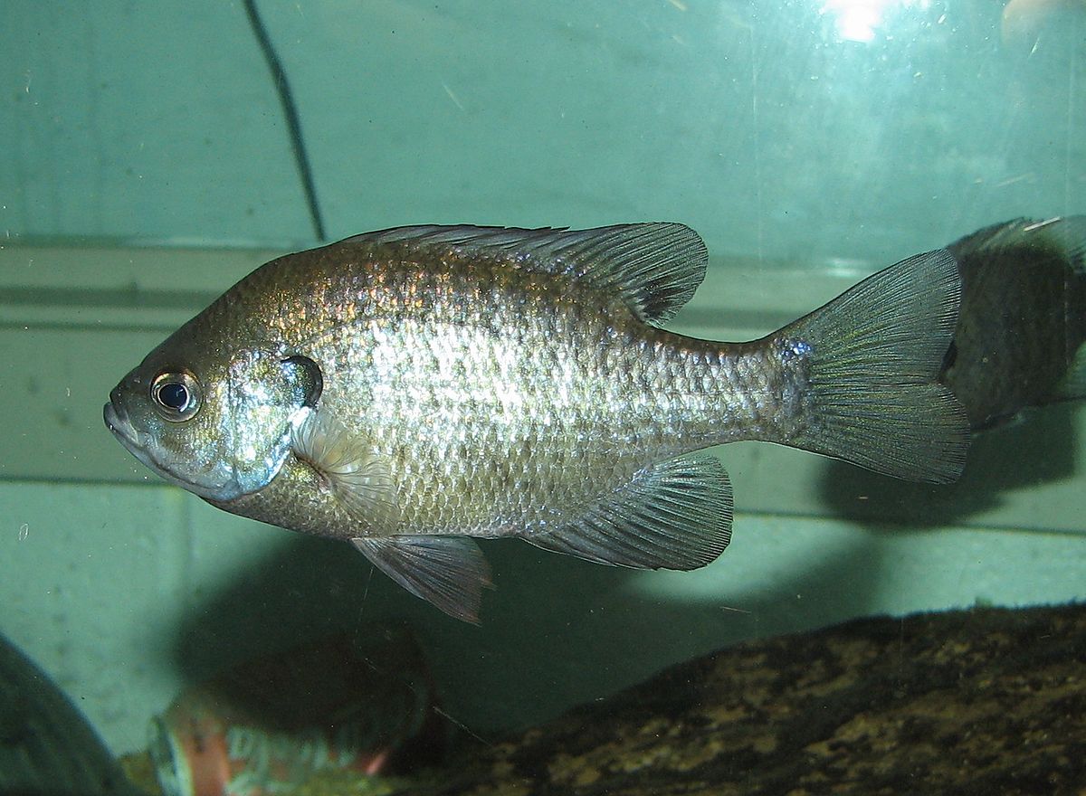
In 1981, n = 78 bluegills were randomly sampled from Lake Mary in Minnesota. The researchers (Cook and Weisberg, 1999) measured and recorded the data concerning length and age of the fish. They were primarily interested in learning how the length of a bluegill fish is related to its age. The data is available under the link .
In theory, the procedure described above should be enough to access the data from a desired website. However, sometimes - and this is the case here - one may have to overcome a problem of certificate validation for a given url. This may be done by writing the following lines:
sage: import urllib2, ssl
sage: ctx = ssl.create_default_context()
sage: ctx.check_hostname = False
sage: ctx.verify_mode = ssl.CERT_NONE

sage: afile=urllib2.urlopen("https://onlinecourses.science.psu.edu/stat501/sites/onlinecourses.science.psu.edu.stat501/files/data/bluegills/index.txt", context=ctx)
After that one can proceed as previously and rewrite the data in a form of a table.
Note though that this time the data is separated by a tabulator; tabulator is denoted in a code by \t .
The analysis starts with illustration of the data:
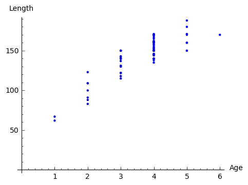
Since the picture resembles more a parabola than a line, we apply ordinary least squares method to find best fitting polynomial of the form
that is, we determine the matrix \(\ B\ \) from the equation
where
Note that the only change in comparison with linear regression is the third column of the matrix \(\ X\ \) consisting of second powers of data representing independent variables. In order to find a polynomial of degree \(m\) that best fits the data, one constructs the matrix \(\ X\ \) so that it has \(m+1\) columns and the \(j\)-th column contains \(\ x_i^{j-1}\ \).
In this particular example we have a serious problem: the matrix \(\ X^TX\ \) is not invertible. This happens because independent variables describing the age of fish are highly correlated: there are a few examples of fish which have the same age. In general such situation indicates that the ordinary least square method cannot be used. However, in practice, the researchers probably did not take into account that the age of fish differed by a few days (or hours). Hence, we can perturb the original age slightly, e.g. by \(0.001\) which corresponds to age difference smaller than a day, and still obtain a valid result.
Denote by xl and yl lists created from, respectively, the first and the second column of the considered data on the bluegill fish (without the first row). Small perturbation of this data could be implemented as follows:
sage: xlm=[0 for i in range(len(xl))]
sage: for age in [1..6]:
sage:     a=0
sage:     for i in range(len(xl)):
sage:         if RDF(xl[i])==age:
sage:             xlm[i]=RDF(xl[i])+0.001*a
sage:             a=a+1
Once this is done, we can apply the ordinary least square method:
sage: P=points([(xlm[i],yl[i]) for i in range(len(xl))])
sage: X=matrix(RDF,[[1,xlm[i],(xlm[i])^2] for i in range(len(xl))])
sage: y=vector(RDF,yl)
sage: B=(X.transpose()*X).inverse()*X.transpose()*y
sage: x = var('x')
sage: par=plot(B[2]*x^2+B[1]*x+B[0], (x,0,6),color='red')
sage: print 'parabola: y =', B[0], '+', B[1], '* x', B[2], '* x^2'
sage: show(P+par,axes_labels=['Age','Length'],axes_labels_size=1, xmin=0, ymin=0,figsize=5)

parabola: y = 14.1077559995 + 53.5604249124 * x -4.64384272392 * x^2
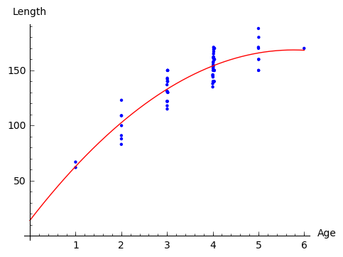
Note that because of lack of information on bluegills at early age, the graph does not give a realistic value at the young age.
Exercises
The exercises can be downloaded in a form of a notebook from here .
Exercise 1.
a). Gather together the code from Example 3 in order to obtain the polynomial of degree 2 that best fits the data on bluegill fish.
b). Use linear regression to add the best fitting line to the picture obtained above.
c). Add to the data the point \(\ (0,0)\ \) which represents additional information that length of the fish at the age 0 is 0.
(The list
xlmcan be extended to contain \(0\) as its first element by a command \(\,\)xlm=[0]+xlm\(\,\).)
Exercise 2. 4
Indiana State University collected data on height and shoe size of its students. You can access this data by clicking a link.
a). Use the data to verify whether there is a correlation between height and shoe size. Write the code in the window below.
b). Now make another illustration of the data, where the data related to women is marked in a different colour. In order to do this define a separate list Fem which collects the indices corresponding to women responses. You can refer to these indices by writing for i in Set(Fem) in place of usual for i in range().
c). Use least square method to describe correlation between hight and shoe size of men (one line) and women (the other line). Present the results on the same picture.
Exercise 3. 5
Researchers Mackowiak, Wasserman and Levine collected data on body temperature and heart rate within male and female respondents. A sample of this data is available at http://ww2.amstat.org/publications/jse/datasets/normtemp.dat.txt . First column corresponds to body temperature (degrees Fahrenheit), second to the gender (1 = male, 2= female), and the third to the heart rate (beats per minute).
a). Use this data to find whether there is a correlation between body temperture and heart beat.
b). Does it matter whether the respondent is a man or a woman? As in Exercise 2 above, perform separate computations for male and female respondents.
- 1
This example was inspired by the article https://towardsdatascience.com/linear-regression-in-real-life-4a78d7159f16 .
- 2(1,2)
- More precisely: unemployment was measured within people of age 15-64; benefits show the proportion of net income in work that is maintained after job loss when unemployment exceeds 5 years, this concerns a married couple with two children. In both cases data comes from the year 2015. Source:
- 3
- This example was taken from https://onlinecourses.science.psu.edu/stat501/node/325/ .The picture of a blue gill fish: https://en.wikipedia.org/wiki/Bluegill .
- 4
This exercise is based on the article and data of Constance H. McLaren, “Using the Height and Shoe Size Data to Introduce Correlation and Regression” available at http://ww2.amstat.org/publications/jse/v20n3/mclaren.pdf .
- 5
This exercise is based on the article and data of Allen L. Shoemaker, “What’s Normal? - Temperature, Gender, and Heart Rate” available at http://ww2.amstat.org/publications/jse/v4n2/datasets.shoemaker.html .